Stimulus 2: Bizness by tUnE-yArDs
Posted: November 13, 2017 Filed under: Cross-listening analysis, Stimulus-wise Analysis | Tags: Bizness, Continuous emotion ratings, Finger temperature, Heart rate, Respiration rate, Skin conductance, Stimulus 2, surface Electromyography, tUnE-yArDs Leave a commentThese graphs report per stimulus the time course of responses across the 24 listening sessions. Some report the general patterns of responses, other show how the listener’s responses changed over successive exposures
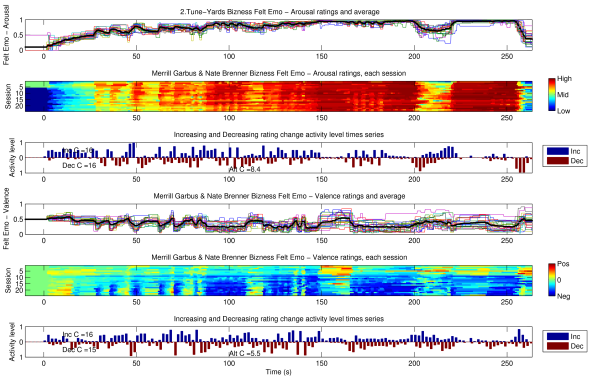
The continuous ratings of Felt Emotional Valence and Arousal, plotted three different ways. First as individual lines with the cross listening average, then layered per session with colour marking the scale values, and finally the activity-level times series reporting the proportion of listenings showing rating changes up or down per 2 s interval.
The music these responses were collected to was Tune-Yards’s Bizness, from the Whokill album. The listener was familiar with this piece and album when they started the experiment.
More analysis available in related posts.
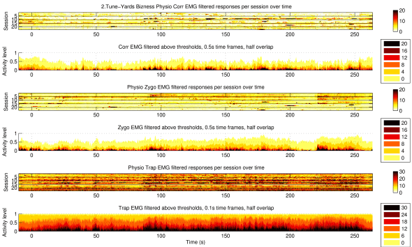
Summary of the three surface Electromyography recordings, Corrugator, Zygomaticus, and Upper Trapezius, across listenings to Stimulus 1. Plots 1, 3, and 5 layer the sessions, reporting normalised intensity of muscle activation by colour. Plots 2, 4, and 6 report activity levels on the proportion of listenings exceeding different thresholds of activation per half second.
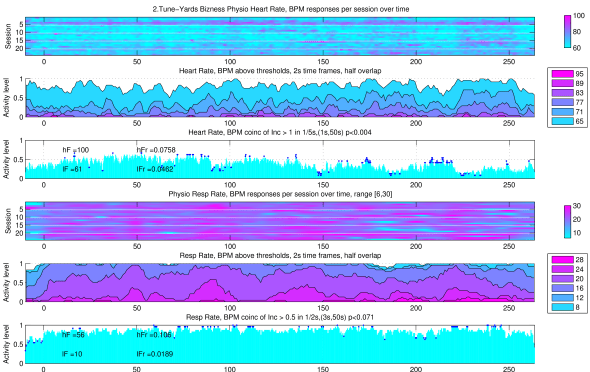
Plots of Heart Rate and Respiration Rate measured during the 24 listenings. Plots 1 & 4: session by session, the estimated heart/respiration rate of the listener, reported in rows will colour marking rate. Plot 2 & 5: Proportions of sessions with heart/respiration rate exceeding various thresholds. Plot 3 & 6: Activity levels of heart/respiration rate increases, assessed for significant coincidence.
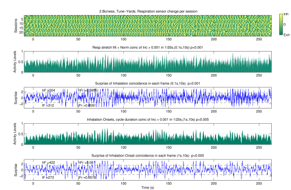
Plots of respiratory phase alignment with the stimulus, along with statistical assessments of these coincidences.
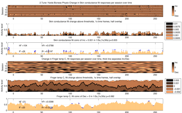
Plots of Skin Conductance and Finger Temperature measured during 24 listenings to Stimulus one. Plots 1 & 4: session by session, the normalised change values of skin conductance and finger temperature, reported in rows will colour marking direction. Plot 2 & 5: Proportions of sessions with exceeding various thresholds. Plot 3 & 6: Activity levels of increases, assessed for significant coincidence.
